This is a guest post from Rebecca Lee, Senior Architect at Pollard Thomas Edwards and Future of London ‘Leaders Plus’ alumna. She and Coherent Cities director Lisa Taylor organised the Dec 2019 #MapLondon conference based on Rebecca’s FoL Proposal for London – and her growing obsession with digital mapping…
In 2017, as part of FoL’s Leaders Plus course, I presented a proposal to improve London by creating a comprehensive, citywide map to help us understand the many layers of contemporary city life. I wanted to digitise mapping, inputting historic and current data to learn about the past, understand the present and see where we might be going in the future. I knew it was a good idea when I realised that many people, across several disciplines, were already pursuing it!
Since the FoL course, I’ve become a champion and a nuisance for map creators, eager to get experts of all kinds talking so they hurry up and build the tools I want to use, both in my work as an architect and as a city-dweller.
The culmination of this was the December 2019 #MapLondon conference, organised by me and Coherent Cities, supported by Future of London, Pollard Thomas Edwards and Commonplace, and hosted by Arup.
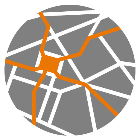
Cartography is a long-standing form of data visualisation and #MapLondon will explore how new tools and techniques are being used to engage and inform built environment professionals and the public. What follows are a few of the issues that have driven me as this event and network come to life…
Should we map change better (again)?
Mapping has historically been a priority following disaster or cataclysmic change. The map below shows the impact of the 1666 Great Fire of London, when narrow streets packed with badly constructed wooden buildings led to 373 acres of the city and 13,000 homes being consumed (Source: British Library).

Similarly, many maps documented the devastation WWII wrought on London. The bird’s-eye view below shows how close St Paul’s Cathedral came to destruction. My favourite fact about this map is that no one is sure how the detail was achieved. It’s been suggested that architect and artist Cecil Brown sketched from a hot air balloon, but there is no proof of this. (Source: London Topographical Society, Pub. No 142, 1990. Photo: Rebecca Lee).

Abercrombie’s 1944 London Plan used creative cartography to respond strategically to the problems London faced during and after the war. It helped structure the approach to rebuilding, but also addressed poverty, overcrowding, poor housing quality and traffic congestion. Having recently surpassed London’s pre-war population, we now face many of the same challenges (Source: BarbicanLiving).

How can digital mapping make cities and regions more coherent?
Back in the present day, the digital maps that 26 of the 32 local authorities have been developing can be incredibly useful for understanding a site in context, or “beyond the red line” as we say at Pollard Thomas Edwards. However, what happens along the many kilometres of edges where boroughs – and their policies – meet?
Further, many of these borough-commissioned or off-the-shelf maps use different levels of information, graphics and interfaces. A consistent strategy is required to stitch these edges together and provide a coherent approach to development across the city. For more on this, see FoL’s work on Overcoming Barriers.
The Greater London Authority is central to this effort, driving cross-borough collaboration and providing valuable data and tools such as the London Datastore, London Infrastructure Map and Cultural Infrastructure Map. The recent requirement for planning applications to be logged via the planning portal informs these maps, to ensure that data is reliable and up to date.
The more I’ve spoken with people developing digital mapping tools, the more I’ve heard that my original proposal for “one map to rule them all” was a terrible one. Who would input the data? How could we make sure it was up to date? How could we avoid misrepresentation? Who/what is included or excluded? Essentially, how could we trust it?
No matter the format or scope, what is critical is that maps, data and the people who work with them speak to each other, so we can plug in different data sets and begin to see where societal needs correlate. #MapLondon connects end-users with those gathering the data and building the tools, providing a platform to expand collaboration across sectors.
Can maps support democracy?
Maps have always been tools of power and propaganda (among other, more benevolent uses). What makes recent advances in open-source data and GIS so exciting is the democratisation they allow. We are moving toward a place where everyone – as professionals or citizens – has access to tools to understand and help define place. ‘Empowerment’ is one of the conference workshops; appropriately enough, the topic was crowdsourced via the Urbanistas network for women in the built environment.
Do maps need to be beautiful?

A critical thing for me is visualisation of data, the wonderful combination of art and science. That maps are digital shouldn’t mean any less attention is paid to the aesthetics of the representation; a map must have a beautiful clarity in order to best communicate information to the user.
This is exemplified in the book Information Capital, by James Cheshire & Oliver Uberti (Penguin 2016). What makes these maps so interesting is the connection between place and people; we can all recognise the shared experience of living in a city, but there is beauty in seeing it from a new perspective.
The visual nature of mapping also drove us to host a poster competition. You can see the excellent finalists here and they were also on display at the conference; attendees received an A3 copy of the winning poster by colleague Peter Watkins (I’d stress that the judges were all independent!).
Can maps bring us together? (Yes!)
In closing, I found it surprising that those who could benefit most from these tools often seem unaware of their existence, but it’s understandable: the speed with which platforms and apps appear is near-impossible to track; experts can operate in silos; and end-users are often too busy to look up or too frustrated to ask questions.
#MapLondon tackled these disconnects by bringing people together across the industry. One of our goals is not just to do better here, but to make London the prototype for collaborative digital mapping, and to lead the way in the UK and internationally. Enabling a global mapping dialogue is a distinct possibility; a proposal for the world, maybe?
To see conference speakers & presentations, visit the #MapLondon page; to find out more, email info@coherentcities.com.